Research and Critical Reflection
At the start of 2022, I came across an article by Franco Berardi named ‘War and (Senile) Dementia’, which talked about the war in Ukraine and Putin, America and the West, and stated that, “In short the West can be defined as a land of decline and obsession with the future…the future can only mean eventual decay”. I was already making politically charged work at the time and chose to combine this with elements of physical decay and found objects such as eroding brickwork or torn down billboard patterning, in order to represent the idea of the decline of society under capitalism in its current form.

"We Need A Hero" - screenprint on found board, 30x50cm

'Nice' - screenprint on found steel plate, 25x40cm
I have found that screen-printing is an effective way of printing onto found materials and creating repetition within work. I had watched an interview with the then Prime Minister Liz Truss which was subtitled and thought this would be an effective way to document the government's failures. I wanted to make the work comedic and sarcastic to effectively communicate with an audience, which would allow them to engage with the work. I did this by superimposing different frames from the video above one another so that different sentences would overlap. I also inverted the image containing the text “the pound tanked” to represent a sort of punch line within the work. I chose to combine this image with a found sheet of steel that was rusting and disfigured to carry on the metaphor of future decay under the current leadership and neo-liberal mentality.


'Fun with Agent Truss' - screenprint on paper
Although the print on the right of ‘Fun with Agent Truss’ is slightly misprinted, I think it is clear what the print is aiming to do, especially when titled and juxtaposed next to the other print and the text that it contains. The reason I haven’t given them dimensions here is that they could be easily blown up and distributed as prints to reach a wider audience.
I think it is important that we make work about what is happening now within the government as there seems to be a general public amnesia towards their failures. On television in 2006 Boris Johnson said,
“I’ve got a brilliant new strategy which is to make so many gaffes, that no one knows what to concentrate on.
'They cease to be newsworthy, you completely out general the media in that way and they despair so what they do, they leave you alone. You shell them, you pepper the media, pepper their positions with so many gaffes that they're confused. It's like a helicopter throwing out chaff, you steal on quietly and drop your depth charges wherever you want to drop them.”
I found this to be a perfect example of contemporary cultural hegemony, as Johnson is clearly stating from earlier in his career his aims to manipulate the media in order to drop his ‘depth charges’ wherever he wants, meaning he used distraction tactics in order to push through far-right legislation such as banning ‘noisy protests’ and forcing voters to show ID in order to vote.

“Hitler found his opportunity and his winning move consisted in urging Germans to identify as a superior race, not a humiliated class of exploited workers. This claim worked then, and is working now on a much larger scale: Donald Trump and Vladamir Putin, Marine Le Pen and Boris Johnson.”
- Berardi, F, Futurability The Age of Impotence and the Horizon of Possibility, Verso, 2017
A collage of Johnson's head placed into a John Heartfield photomontage of Hitler with gold as his internal organs.

I wanted to do some experimenting with inkjet printing directly onto canvas and so I decided to cut out some images of the public watching Matt Hancock on television, whilst the government drop 'depth charges' over them representing distraction tactics. I found that this was a quick and easy way to print colour images directly onto canvas however the quality of the images regarding the colour is limited.
I began experimenting with dye-transferred inkjet images printed by laying the paper on top of another sheet of paper, applying actisol and then either feeding them through a roller press or by applying pressure manually by rubbing a hard surface (I have used a spoon and a hammer end) over the paper. I found this method gives a different effect to how screen-printing works as you can manipulate the images differently, however, it is more difficult to control how much actisol you apply and can smudge an image – which could be effective if that is what you want. This method also allows you to combine your own marks as with Rauschenberg’s ‘Dante’s Inferno’ series.


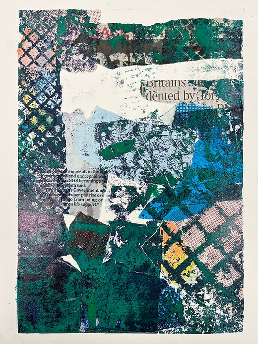
I chose to use images taken from the media, combined with images I had taken which I felt represented the working class and then combined them with images of decay. The central image above contains: images of machinery from the factory I used to work in, a welder welding, commuters waiting for a crowded underground, a newspaper title detailing plans to strike over pay and working conditions, a decaying set of floor tiles and decaying billboard material with COSHH regulations screen-printed over them. The workers in the image are positioned below King Charles and Rishi Sunak who represent the ruling class with Rishi's backbench looking on from the corner. Similarly, in the image on the right, the workers are concentrating on their crowded journey to work, whilst the government are watching them. The print is overcrowded with elements of decay as well as patterns taken from the floor tiles in Peckham's over ground station which perhaps take focus away from the text that details the governments failures with regards to adequate pay within the NHS. The aim of the work was to outline how the government are controlling the working class but are not providing them with the pay and working conditions they require and deserve, portraying the key elements of economic hegemony.

'So Much for Democracy!' - dye transfer on paper 35x29cm

'South Gare Demolition - They Dont Speak for us' - image transfer on billboard material and paper, 29x21cm
By this point, I had begun to intensify my research into 'Cultural and Political Hegemony' according to Italian Marxist theorist Antonio Gramsci. Gramsci's theories refer to the domination of the working class proletariat by the ruling class, through means of social and economic institutions which allow those in power to influence the 'norms' and expectations of society. Political hegemony is most strongly manifested when those ruled simply accept this as a way of life, as opposed to these deliberate acts with a political and social agenda - set out by those with power. This is apparent within the prints above as the workers look-on to their 'superiors' King Charles and Rishi Sunak - both unelected leaders of this country. 'So Much for Democracy!', also contains these characters, this time placed next to text reading "REMOVE THIS" and "FUMES ARE POISON" which were taken from a welding instruction manual.
'South Gare Demolition - They Dont Speak for us' - is an image of the blast furnace in Redcar, Cleveland, being demolished as workers look on - meanwhile the image juxtaposed below is one taken from a newspaper of the unelected Rishi Sunak and his Tory backbenchers, who are facing away, ignoring the workers.
Etching
The process of etching involves the erosion of a plate in acid in order to bite into the surface which is then inked and printed into damp paper. The process also involves bevelling edges, polishing, burnishing and manually turning the rollers, much of this reminds me of when I was working as a fabricator, which relates to my current practice. To add to that, the erosion of the metal can be symbolic of the decay and damage caused by capitalism and so I began experimenting with various etching processes.
This is an image of a steel plate which has been screen printed onto with rines varnish, as part of a process named ‘screen-etch resist’. Steel etches with a grainy grey consistency and I felt that this particular property would suit the concept of the work.
Here I am attempting to combine dye-transfer and screen-printing before finally etching the plate. I had hoped that this would portray conflict within the work as to amplify the subject matter, similarly to how Chila Kumari Burman worked when creating 'Riot Series'.
This however proved problematic as at the dye-transfer stage of the process, I had applied too much actisol in the centre of the work, which then did not quite expose fully.


Next, i decided that i would experiment with two plates and with colour, once printed I found that, aside from the fact I didnt like the way the colours turned out, i had made a print that looked very similar to a screenprint, which could have been done way quicker. I decided then that i would use CNYK to replicate this to compare the two methods. I also decided to take one of the plates a step further and experiment with sugar-lift which made the image much grainer and harder to decipher giving the print a much rougher, almost dirtier presence linking back to the concept of decay.


'Grainy Days'- etching with sugarlift and aquatint on Somerset, 35x29cm

'So Much for Democracy' - screenprint on paper 35x29cm
I decided I wanted to experiment with photolithography as a way of reproducing an image, that I could then work into. Similarly to screen-printing, this method allows you to print onto different paper and so I opted to include decaying billboard advertisement paper, relevant newspaper articles and old screen-prints of COSHH regulations with words such as ‘DANGER’, ‘CANNOT BREATHE’ and ‘REMOVE THIS’. I found this was an easy way to combine methods and re-contextualize old prints when collaged and combined with new imagery. The outcome gave the prints a painterly presence which I think would be more successful enlarged. This would also blow up the words contained in the prints and perhaps make the work clearer to read whilst keeping the abstract mark-making element.
Through this, I am attempting to combine examples of Gramsci's theories on hegemony and Bifo's on decay under capitalism.


"Britain's dented by Tory"


Following feedback, I decided I would bring forward the text within my work and begin to experiment using etchings as a surface to work upon - as opposed to the forefront of the work. I did not want to abandon the way in which I had been making work, but at least wanted to experiment with how I felt about making this way; perhaps there could be room to approach making work using both methods?
“And What Hurts” contains lines from a letter by Bukowski to his friend outlining his experiences of labour and how he recognised it as an exploitation of workers. This is stamped over the ink-transferred image of people waiting for the underground, which is reoccurring throughout my recent work. The word 'diminishing' points towards the people, representative of the decaying theme and also taking influence from work by Glen Iigon, whos text based work is often abstract and difficult to fully decipher. This draws in more attention from the audience who then go on to read, "Those fighting to hold jobs they dont want" one of the key attributes of neo-liberalism and cultural and economic hegemony under capitalism.
"Monday Bad or Genuine Ill?" is a quote taken from a 'Facebook memory' of mine, which I remember writing in reference to the dread I was experiencing about the coming week, due to my job. This is an inkjet-dye transfer of the above etching detail (centre) which features text from the media arguing for better working conditions and pay within the NHS; it also features text from COSHH regulations from a welding manual which i had screen-printed on to torn down billboard paper previously with words like "cannot" and "breathe" prominent.
This process is highly unpredictable and much of the clarity is lost because of this, however the marks left depict decay and erosion and create more of a sense of misery in a more ambiguous way. Similar marks have been printed on top of in "Choices 2022" which combines them with text taken from a newspaper. The headline was intending to document good news - that there were spaces for homeless people to stay warm, however I saw this as regressive, as I felt it normalized homelessness. To add to that, the headline seemed aggressive, as if it were ordering its audience to be warm, when in reality many do not have a choice - which lead to the title of the work.
These prints could be blown-up to a much larger scale and distributed as posters/leaflets or displayed as prints, meaning they have different ways of engaging with an audience. I may also begin experimenting with printing headlines or relevant sentences onto clothing - this would create a conversation with people and could be seen as performance.

'Monday Bad or Genuine Ill?' - etching on Somserset

"And What Hurts"- letterpress and dye transfer on paper 26x21cm

'Choices 2022' - newsprint and letterpress upon etching on Somerset


'Okay/Will Do' - etching on Somerset, 15x21cm
Having taken words from newspaper headlines previously, I decided to experiment with creating an etching of the actual front page itself by taking an image and dye-transferring onto zinc. With the process being unpredictable, the results appear clouded and hard to decipher, but when enlarged or if you look closer, you see the ghost-like figures surrounded by clouded forms and parts of detail. When paired with the text, I believe that it forms a narrative and as the image is clearly from the media (see page 13/font etc) it draws the viewer to come to a conclusion about what is happening within the image and perhaps, in a broader context, society.
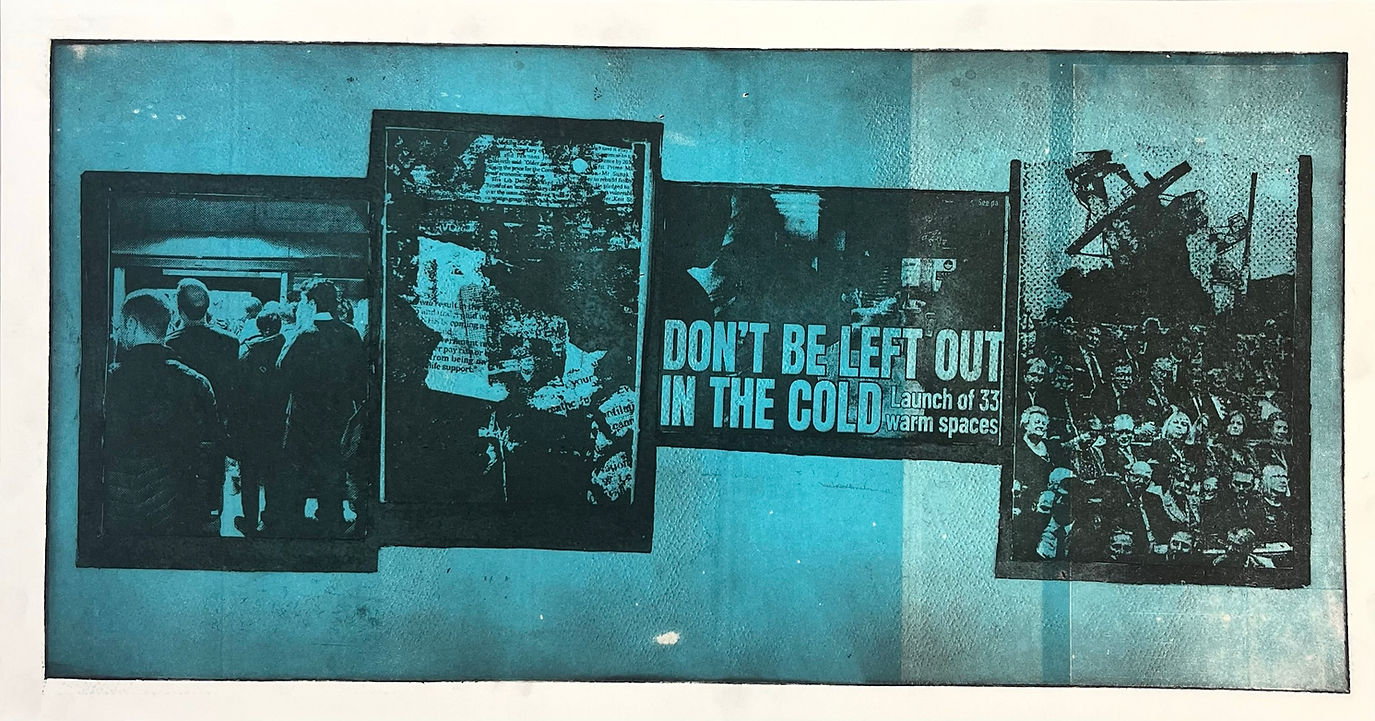
Another reason for experimenting with this image, is that I wanted it to feature within a collection of images, aimed at outlining labour under capitalism and the pressure on the worker to perform. I initially wanted to feature five images, simply for aesthetic value, however resources meant a limited steel plate size and so I could only really fit in four images. I chose to use the image of workers waiting for the underground, the newspaper front page, 'South Gare Demolition' and the original detail used for "Monday Bad or Genuine Ill?" as I believed that these four were the best representation of what I wanted to say, however in the future I am going to select clearer images, as at the Pop Up Show I found I was having to explain my work because it was too difficult to decipher.


After polishing the steel, I screen printed the images (which are inverted) with rhines varnish. This stops the printed on parts of the steel from etching, leaving the etched parts as your original image.
This process is more predictable than the dye-transfer process as rhines varnish is much more effective at stopping out sections than ink-jet ink.

Initially, i made a mistake regarding creating borders and so I had to stop out the entire plate in order to add them. I had questioned whether or not they were needed - but opted to add them in in order to keep the images separate and clearer.
The four images positioned on acetate, ready to be exposed on to a screen for the screen-etch resist process

"Fear The Alternative Worse" - etching on Somerset 35x80cm


"I have selected 4 images which I intend on documenting together, as I believe they support each other. The first is simply people waiting for the underground which is followed by a collage featuring the same image, as well as text containing words such as “underpaid”, “payrise” and “life-support”- these are juxtaposed with patterning from flooring in the tube station (decayed, trampled on and dirty) as well as torn-down billboard paper (advertising as a metaphor for capitalism) which will then erode when etched. I will then screen-print a line from a Bukowski letter to his friend, which reads “but fear the alternative worse” which I typed using letterpress relief techniques and have repeated multiple times to strengthen the sentence. The next image is the newspaper article about “heated areas” which provides a visual example of “the alternative worse” – perhaps keeping its audience ‘in line’. The final image is ‘Sough Gare Demolition’ and represents the government’s lack of regard for its workers, specifically here in the north with opportunities becoming thinner in numbers every year, especially in relation to the recent funding (or lack of) in this year’s “levelling up” scheme."
Above is the key elements of my notes about this work


I chose to use aquatint, not only to create the borders - but also to intensify the colour in the etched sections of the plate. This allows you to create deeper colour as it etches these sections further. Because these parts were etched deeply, I was able to relief role over the plate after it had been inked up to etch, this is because the ink was deeply set into the plate after inking and so the thin layer of blue(which was mixed with extender to further thin out the colour) was able to sit on top, creating a two colour image. The image to the left above, appears to have defects which is where the oil of the extender mixed with the water within the paper when printing. I actually enjoy the marks created and believe it fits in well aesthetically with my theme of decay and conflict. These successful mistakes are a major aspect of why I enjoy printmaking in general.
With regards to the colour, this is probably the first example of where I am considering colour within my etchings. Previously, I had been experimenting and researching the technicalities of etching and although this was furthering that with regards to relief rolling as an aspect of printmaking - here I am thinking about colour and how it affects an image. I chose blue for two reasons, the first is that: in this country, blue represents the right and Capitalism and secondly, because of the connotations it has with meloncholy and depression, supporting the theme of decay and a need for change for the tiring workers


I had seen others using sugarlift within their work and I thought this would be an effective way of adding gestural mark making into a print. When painting, I have used expressionistic mark-making in order to represent my emotions, often throwing paint at a canvas in response to government actions or legislation. Here the expressions are very limited due to the size of the plate but I am happy with the outcome as i still feel a sense of violence and anger within the work. To add to that, in a more literary sense, the marks here when etched and printed further depict erosion and disfigurement, as if the image has been broken and weathered.

"Fear The Alternative Worse II" - etching on Somerset, 35x80cm
Next, I wanted to experiment with digitally enlarging and printing the image, in order to explore new possibilities for the work regarding scale. Firstly, the image was scanned and edited on photoshop (to look like the original as the scanned image was slightly different in colour) before printing on a large printer. We printed a few examples to test how out the image would look and after a few tweaks, we managed to get the image to look how I intended. The scale of the work is something that many people have picked up on, with comments regarding how much more successful the print becomes when enlarged, especially in relation to my concept and how the work may strike an audience. I do plan on finally screenprinting into the work as initially planned and am preparing for this at present.


Digitally blown up version - 100x200cm
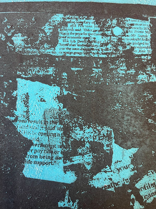
(Right) This is a close up of some of the minute details which the scanner has picked up and blown up. These tiny details are some of the reasons why I believe etching aesthetically supports my concept and the possibilities with digitally enlarging my work are very exciting to me moving forward.
(Left) Examples of different edits of the image before choosing the final edit.


I have also been experimenting with chine-collé in my work as well as mono-printing - prior to printing the etching. With influence from Chila Kumari-Burman's 'Riot Series', I am still trying to support my subject matter with technical conflicts such as etching on top of a monoprint and screenprinting on top of that (etc). This example is my first and am not happy with it, as it appears clumsy and messy as opposed to deliberate and meticulous but will keep experimenting as part of my technical research. Similar to sugarlift, I also see this as a way of my own expressive gestures becoming a part of the work.


Pop-up Show 15/12/22
At the time of the pop-up show I had only just completed the screen-etch resist stage of "Fear The Alternative Worse"
I chose to showcase my print alongside "Choices 2022" as they both contained the same dialogue. The audience were also encouraged to take home digital prints of "Choices 2022" as part of my agenda to engage with a wider audience and for them to remember a time when the economy was so bad due to the government, that homelessness was such an issue that communities had to create warm spaces for them.
The prints next to mine are the work of Ruixao and are focused on the concept of 'post-humanism' and futuristic war based on computer games and sci-fi films. I thought my work being close to this would be appropriate, as his concept largely focusses on conflict and violence and futurism, whilst mine also thinks of the future in a pessimistic, not-too dissimilar way.
In hindsight, my work here does not engage with any audience as the detail is too small and too ambiguous. The inclusion of the table in front of the piece means viewers cannot get close enough to decipher the work. I wish I had made enough time for me to make the larger, digital image. Also, with the handouts, they definitely could have easily been larger and even provided context on the back. I would have liked to have had placards of information (titles etc) but felt if one person in the show had one, then everyone should have and this was not the case.
Conclusion
I think to progress with my practice I must find clearer imagery/more direct headlines/carry on finding relevant columns. I need to find time to collect more images myself by attending protests/strikes/generally going out more with the intent of finding content. The possibilities of digitally enlarging my work whilst maintaining the etching aesthetic is very exciting, as this means not only can I easily alter the scale, but I can work into etchings with paint or drawing or screenprint easier and with more freedom.
I am thinking a lot about where my work situates with regards to engaging an audience and who that audience is. Am i addressing the working class and trying to enlighten those unaware of the cultural hegemony in this country? Is is demeaning to assume that others are unaware of the exploitation of the workers? Am I attempting to alter the minds of the ruling classes by highlighting the problems the workers are facing? Can I find a way to do all of this and more and if so how? I have been advised to follow in the footsteps of artists such as Peter Kennard and Banksy, of which have made their work public through billboards, newspaper stands and graffiti etc, meaning my work ought to be fresh off the press and extremely relevant, meaning I must work quickly - which does not necessarily suit etching as a process. I have also been advised to look at protest art and how this situates historically. I believe my work can position somewhere in between; somewhere that is relevant and contemporary but is also historical, reminding my audience about what is happening as there is so much going on that it is easy to forget. I know this because I am a culprit too. I often think about the Johnson quote that I mentioned earlier about "peppering the media with so many gaffs that no one knows what to concentrate on". As opposed to news outlets and other forms of media, maybe by creating artifacts in the form of artwork, there is a different way of supporting the working class under the exploitive laws of capitalism and cultural hegemony.