Unit 2: Critical Reflection
I began this term optimistic about the possibilities of upscaling my work digitally and furthering my exploration into etching. Some of the processes involved in etching and printmaking in general, had begun to remind me of my previous career fabricating, not only because of the physical and manual elements, but because of the routine involved in ensuring everything is done correctly and if not there will be ‘failures’. I have been exploring how far I can push steel as a material, often turning ‘failed’ or overworked plates into prints or sculptures.
In Unit 1, I had been experimenting with sugarlift, which allowed me to add expressive gestures to prints. In steel, these marks can be etched as deeply as you need, giving texture and different tonal effects to colours within the finished artwork. I wanted to experiment with this by pushing steel to its boundaries, even if it meant the acid etched right through the steel. I also wanted to experiment with how I could manipulate this into affecting the edges of a plate, which would enable me to move away from square edges and work with eroded edges forged and decayed by the acid.
I showed one of these prints in a group crit and one of the comments made was that it looked as though I was working against the material, as opposed to in conjunction with it; exploiting it through extended acid exposure.
This reminded me of the relationship between the worker and the employer with regards to what I had seen and experienced in certain jobs and aligned with Marxist theories surrounding the exploitation of the working class. Another theory relating to this is Gramsci’s theory of ‘Common Sense,’ which explores how workers are exploited by the belief that they must ‘pull ones’ self-up by the bootstraps’ in order to achieve financial success; suggesting that, those who are wealthy have achieved this by working hard, but also suggesting those poorer are simply not working hard enough. I allowed this to influence where I went with this plate and others to follow, by overworking the steel in order to gain success - but in effect representing the consequences of fatigue through dark, harshly etched lines and textures that show the acid biting deeply into the plate.

I was happy with this concept but wanted to continue experimenting with different ideas and decided that I wanted to add imagery or text. I chose to include a line I had previously used "fear the alternative worse", taken from a letter by author and poet Charles Bukowski to his friend John Martin, discussing his life working a 'nine 'til five job' - as this was a direct response to the hardships of being overworked. You must live this way and work this hard or you will not succeed.
I also chose to work with a simple line I said in a sentence as a response to 'Honest Burgers' stripping their employees of their paid breaks; something I oppose; "You only need a break because you are at work". For me, it is simple, you would not need a break if you were not at work, breaktime is part of working and therefore you should be paid.
Whilst screen-printing this, I decided to work without taking breaks in between screens, knowing that the wet ink on my paper would print back onto the underside of the screen and then back onto my paper and 'ruin' the print. I repeated this process as many times as I could before the screen dried up, which clogged up my paper and made some of the text almost recognizable. This depicts further, the importance of taking breaks whilst working. If workers are overworked, mistakes or failures occur and so breaks are vital for their health as well as productivity, further proving the point that breaks are part of work and that workers should be paid for this time.


25x15cm
25x15cm
Digital print
Some edited images of the text I used to make a screen for screen printing. The work incorporates the surface underneath the film it was placed upon, as well as marking from old screens with the same text.


'Pay ME for my time' - screenprint, 100x30cm
The next step for this was to scan a section of the image, flip/reverse and screen print the etch resist on to my plate. I then followed up with deeply etched marks and gestures done with sugar lift, before reprinting sections of my image back onto the plate. I did this three or four times, with the text at different sizes, in order reinclude text that had been lost when deeply etching other marks. I also began to add an aquatint to darken text to match the sugar lift elements in tone.


Work Break - etching on Somerset, 35x20cm

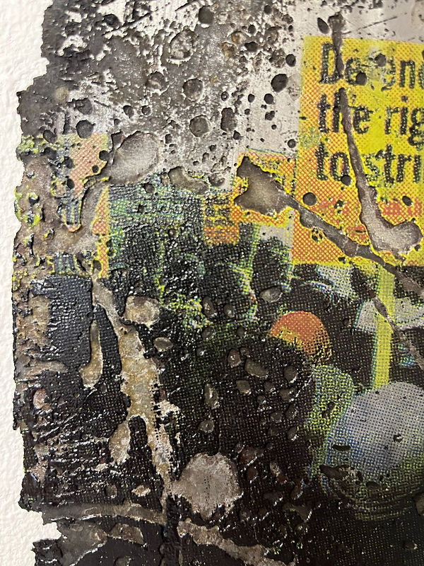
For the Filet show, I decided I would create a similar plate and had two ideas; one to show the print made from the plate and the other to submit the plate itself. I decided for the physical plate idea, I would screen-etch resist text taken from Boris Johnson’s rant about peppering the media (although on hindsight I should have chosen something more related to the concept of the work) and etch it deeply so that it ingrained the steel and be visible. As I over-etched the plate when deeply eroding the sugar lift, much of the text became lost with the surface, however I like the decayed and textured aesthetic this caused and is something I incorporated in my submission for the 'Bargehouse' exhibition. I also learnt further down the line about how to recover these surfaces using grinding methods.
Because of how deeply the plate was etched, the print itself turned out almost completely black and simply became an organic shape printed on paper. I liked the semi-sculptural way of which this shape related to the white of the paper and how it textured its surface, so I decided to try and work with the ghost print. As the textures are so varied and deep this allowed the plate to hold a lot of ink for the ghost print, meaning it became a completely different image, and so I decided I would exhibit this work, with the title ‘Overtime’, as it has connotations with exploitation at work and being fatigued and worn-down.


'Overtime II' - etching on Somerset, 10x9.5cm
'Overtime'- steel plate, 8x7.5cm
I have found that when etching, it is best to work on multiple plates in order to save time and experiment working in different ways. I had been working on this plate simultaneously with others and had etched holes right through it, as well as eroding the sides away giving the plate organic edges, which is what I wanted in order to depict natural erosion and decay as opposed to manually manipulated edges. This was because I wanted to give the edges a sense of physicality but also that they had been slowly manipulated and disfigured over time by the process. I felt if I had curved the edges myself it would take away this authenticity.
The first prints came out as I had expected, almost fully black (even though I blended other colours amongst them with the ghost print in mind) and so, I knew I needed to spend some time polishing the image, uncovering old surfaces and smoothening sections of the plate in search of detail and areas which would hold flat colour. I had accepted that I had etched away any imagery that had been transferred originally, similarly to how long-hour careers strip away individuality and autonomy. Again here I was working against the material's surface, etching away the image it once contained, in pursuit of creating worth. The plate began to appear fatigued and worn down but with a dangerous fragility due to its eroding but sharp edges.


Ghost Print of first prints for this plate at this state.

Originally I spent several hours polishing this plate with wet and dry sand paper, eventually moving on to 240 grade sandpaper, but the results I was achieving were not what I had hoped for and so I decided to use an angle grinder and polishing pad, which is something I have worked a lot with in the past. The metal workshop upstairs had what I needed for now; however moving forward, I know where to purchase the correct pads and discs etc for what I need. This decision proved a success and the results gave me closer to what I had imagined at the start of the process, the next steps for this are to reprint imagery or text upon the steels' surface and re-etch these into the plates.


I began to experiment with À la poupée to combine different colours with one plate. To add to that, the varying depths of my plate allowed me to apply ink in three layers using a technique known as viscosity printing, which relies on applying ink using a scrim and soft and hard rollers to contact the different layers, with wiping in between. I had noticed in comparison with others’ work who had layered their prints specifically for viscosity, that my print had muddied more. This was because my work consisted of probably hundreds of levels as the deep-etching process tends to underbite the resist and work into the whole plate. This meant I could not apply the different layers clearly, however I did get some interesting results in terms of colour and texture.
Next I began to use these experiments in order to create another plate and decided I would work with one of my old plates, which already had manufactured holes in them. I decided to print two images of people waiting for the underground but chose to position them facing away from each other to symbolize a lack of solidarity amongst the working class in relation to Berardi’s ideas regarding the social collective consciousness. I then separately printed text taken from his book ‘Futurability; The Age of Impotence and the Horizon of Possibility’, which reads –
Why do people not strike all the time? Why don’t people rebel against oppression? People are unable and unwilling to revolt because they do not see the autonomy and solidarity because of the precariousness, anxiousness and competition that are linked to the present organization of work.”
The text requires more attention and intimacy to make out, which aims to draw in more attention from the viewer.
Next, I etched away the sides of the plate as well as sugar lifted marks to carry on the process which I had been working with. This text is then etched fairly deeply and begins to lose its form, deteriorating and eroding away from the plate so that certain words such as ‘oppression’ and ‘competition’ are left visible accompanied by the ghosts of other phrases.

'Shattered' - etching on Somerset, 45x34cm

'Exploit' - etching on Somerset, 38x62cm

I wanted to explore the possibilities of progressing the print further and decided I would scan an image of the print and digitally enlarge the image, in hope of making this rough, physical etching become more towering and powerful. This would also enable the viewer to see clearer the text within the work.
The text on the plate itself had etched deeply and became a course texture on the steel’s surface. The sugar lift marks presented gestural elements of this texture, morphing the plate into a painting made from eroded splashes, scratches, marks and text in its surface.
The plate in general has been transformed from a plain sheet of steel, which is hard and rough to work with; into a very fragile and shattered, yet sharp and dangerous looking artefact that others have likened to relics. This transformation is one that interests me, as I see its erosion metaphorical for hard labour and the effects of exploitation on the worker and their health; linking back to Gramsci's theory of "Common Sense" and the pursuit of success under capitalism.


'Exploit' - digital print, 100x200cm
'Shattered' and 'Exploit II' - steel plates at Barge House, OXO Tower, 35x24cm and 28x52cm
I chose to exhibit this plate, alongside another of my plates named, "Shattered" at the Bargehouse Exhibition. I felt in this setting they would work well, not only visually against the brick wall backdrop, but conceptually due to the industrial setting and with the work-yard outside the windows. I would have liked the plates positioned next to the windows so that the audience could see the work going on outside adjacently with my sculptures, but they were not in my initial plan and so I felt it unfair to take up space where somebody else may have wanted their work. Furthermore, the building is remnant of abandons or ruins and much of my work involves elements of ruin through exploitation and fatigue.
I titled this plate "Exploit" after the way I had treated the plate, overworking it to the point of it becoming ruined or decaying, in the strive for creating a successful artwork, as aligned with the worker's strive for capital according to Gramsci's theory of Common Sense.
"Shattered", is the plate for the print above which shares its name, which is titled after the word affiliated with fatigue but also broken glass or other plates, suggesting its state is because of its exhaustion.
With regards to progression for these works, I am looking to create an installation based around them. I want the works to be free-standing and so I am looking at ways of achieving this which include fabricating steel structures with legs or a casting cement at their base. The plates will be head-height, personified by their shape as reference to a body with a head at the top and the inclusion of text, referencing protests and labour-related terms. I have begun to experiment with how to include imagery on these plates and completed a 'CMYK' print on 'Exploit', of an image I took at a protest recently, which was in opposition to the anti-strike legislation that was, on the day of the protest, voted in favour of by the government in the house of Commons.

I chose to exhibit a large-scale digital print, 'Fear the Alternative Worse', at the Bargehouse exhibition for a few reasons; The first being that i thought this was the strongest print/piece of work, that I had made so far; also, we had been recommended to carry on making work and going through our research and experimentation as top priority, as opposed to making work specifically with the Bargehouse opening as a deadline. I was at this point dedicating my focus on the CMYK screen-etch resist printing process and experimenting with how to carry this out successfully, so it made sense to me to show work that I already had made and that I was happy represented my practice. Furthermore, the building itself with its industrial, decaying walls and nearby work-yard, were exactly what I had envisioned for where this print would be shown. During the curating process we considered other rooms with lesser brick-work but this did not seem right visually for my print and I feel in the end it worked with its backdrop well.
With regards to the two plates that I also showed, I feel the print worked well neighboring the pair, however I would have liked more light for them and perhaps more room. This could have been achieved had I not chosen to show another plate and in the end I regretted this decision. To add to the fact that it limited my space, the plate is the etched plate for the large print, I thought that this would be interesting as the actual print was missing from the exhibition; only the plate and the enlarged version were shown. However, I felt (when it was too late) that this gave away how my print was made and maybe it could have been exhibited in a different room or not at all. When I received feedback for the show this was mentioned again.


Images from Barge House exhibition.
The next step for me in terms of the technical side of printmaking was to push the boundaries of both CMYK and screen-etch resist printing. I wanted to be ambitious with this and decided to make a print of collaged images I had taken of Peckham Market fruit stalls, which everyday remind me of the routines involved in the patterns created by capitalism and the strive toward financial success. Initially, I had begun collecting images of rubbish bags, colourful and messy, and dye-transferring them to paper, but decided to go with the fruit images to be ambitious with colour. That being said, I feel the concept was lost in the final image making, as the work appeared to me as more of a celebration of capitalism, containing attractive looking fruits and colours and reminding me of the term "fruits of your labour".
%20copy.jpg)
'Routine' - image transfer on paper, 30x46cm
For CMYK, you need four positives separated and then aligned on top of one another when printing. This meant I would need four steel plates, meaning four plates to polish, sixteen edges to bevel, four plates to degrease and four plates to aquatint. Furthermore, when printing it would mean four plates to ink and four to clean, relating back to the concept of the work addressing routine and labour. That being said I still began to feel the imagery was too pretty and clean for what I wanted to portray, but decided to carry on with the process as research.
After the first couple of prints, we realised that this process was not going to work successfully on this occasion, as the separation needed to be done elsewhere using different software. This resulted in some of the colours clashing and muddying, which was also affected by the graininess of the steel, a quality which I had took advantage of before but was now working against me. To add to that, I recently discovered that sometimes with printed out images or images taken of other images; there may already be half-tone dots present and not visible to the eye. This would also affect the separation of colour when using CMYK.
I had anticipated that the final print would not be as bright and vibrant as the digital print and I had not wished for that result anyway, but the final print was just lacking what I had hoped for and so I decided to abandon this image and experiment with sugar lift and what would happen if done on separate plates when using CMYK.

'Routine' - etching with aquatint on Somerset, 48x66cm
I was hoping that the sugar lift would increase the tone of colour in certain areas, as well as add texture to the print. My main goal here however was to experiment with how this would affect the image itself; when the marks intertwined would they confuse the eye and create knew imagery and colour? Would I then be able to polish back the image to bring out highlights of these new colours, revealing the original imagery wherever I wanted?

The resulting print appeared strange and sections had further muddied due to the increased tone in the deeper etched sections. Here I used two methods of sugar lift, the first was the same method I always use, apply the sugar lift solution, then the straw hat, then remove the sugar lift solution with boiling water and cotton wool. The other method, which i applied to the magenta layer, involved removing rhines varnish from atop sugar lift solution using white spirit and a rag - the marks created are completely different as the image is clear underneath.
I wanted to show this print in a group critique because I was curious what others would make of it. The feedback was something like how I expected, that the print was too messy and abstract and that the concept was maybe lost, especially after the sugar lift was applied, however comments also stated that the print was very rich, which I was relieved to hear because I had made my mind up that I was going to attempt this technique again, taking on board what i had learnt. It was also suggested that I ought to consider avoiding the combination of two modes of thinking, in this instance mark-making/painterly-gestural imagery and documentational image making, in order to achieve clarity within my image making, something that I understand is sometimes lacking from my work.
The screen-print for this image worked better because the separation was done adequately for this technique and you can achieve better colour when working this way. The whites of the paper shine through the dot separation making it brighter and more vibrant. I may do a series of these prints relating to routine under capitalism using this technique as I feel after feedback that other supporting images may strengthen and clarify the concept behind the work.

'Routine II' - silkscreen on paper, 45x65cm
The next step for me to was create a successful CMYK screen-etch resist print, so I decided
that next I ought to start planning the image.


I began using dye-transfer to combine images of decaying walls and billboard which i wanted to juxtapose with text. I tried to find headlines or other text and came up with a few options, one was a headline reading, "Profiting From Pain", but I went with a word that kept reoccurring whenever I was planning or thinking back to my time as a fabricator and that work is "Overtime". I then questioned how this could be added to my print, was it a question? "Fancy doing some overtime?" or was it a statement which related to well enough and clearly about the exploitation of workers and their time/health/labour power.
For me the option of overtime was never a question it was practically forced. It meant at least an extra 10 hours of work a week and it meant getting out of bed earlier and coming home later. It meant fatigue and it meant exhaustion. For me and I am sure others, overtime has connotations to the exploitation of the working class under capitalism, and relating to Gramsci's theory surrounding 'common sense'.
As mentioned, I collaged images together and tried out a few of these but in the end I went with a decayed wall of torn paper, with an image of striking workers displaying a placard reading, "UNDERPAID UNDERVALUED OVERWORKED". The word overtime reacts to this as the capitalist employer only cares for increased productivity as opposed to the workers welfare. This time I anticipated the graininess of the steel and chose an image I believed would work with this in order to create a mood and a miserable looking tone. There are cracks in the background of the image and the large sticker in one corner looks as though it reads "WAR". All of this was contemplated when I made the image and then digitally cropped and edited sections.


With regards to printing the image, I have made altercations to how I have inked and printed the plates in order to achieve clearer colour, this involved changing the order, moving magenta to third from second and not mixing it with extender in order to brighten the reds. To add to that, I spent hours polishing the plates prior to etching and each had a double aquatint dropped and was openly bit for 3 minutes so that I could tissue wipe the surfaces better to bring out the whites in the image.
Registering the plates has proven awkward and I believe that this is because of the length of the plate and the amount of times this is printed into the wet Somerset, causing it to change shape each time. After many prints which are always nearly fully registered, we decided to change the direction of which the plate enters the rollers, meaning the paper has less chance to stretch, we gave the plates one millimeter a time to stretch and found that this method was successful.


'Daily Battles' - etching on Somerset, 56x76cm
There are still some tweaks in terms of inking that I need to correct, as well as trying out a whiter paper. To add to that, I may add some tiny dashes of sugar lift to the black layer and maybe the magenta, as well as etching the word 'overtime' deeper, so that it embosses more than the rest of the print, into the paper. These are some of the reasons why I chose to make this print into an etching. Furthermore, using steel and going through the processes involved to make art from this material, remind me of fabricating. I am yet to polish the edges as I have only just completed the registration, however, this is another physical task that requires graft in terms of manual labour, all of which I want to go into the print.

'Monday Again' - oil stick on paper, 30x100cm
I have left this short section on drawing until the end because I feel like with my print works, they are some what linear and lead on to the next one and reads easily the way I have layed it out. I started depicting figures like this a few years ago but was unsure at the time as to why; I believe they take influence from 'Samuari Jack' artist Genndy Tartakowski, whom I admire for the way he depicts body language and gesture through simple shapes and lines. After feedback about this work regarding the whites of the paper, I chose for my next drawing, to work on top of some digital print outs of etchings. Next I experimented with scanning these images in and altering them on photoshop.


The next drawing I made was much larger and I wanted to use colour. I dyed the background prior to drawing using coffee and water and diluted acrylic paint. I began drawing harsh uncomfortable looking shapes which often look triangular with three points. I had decided that I wanted to express how I felt about the exploitation of the working class under capitalism through shape, colour and other symbolic elements.
The drawing includes figures depicting the government at the top right corner, in reference to the hierarchy of classes with the ruling class being at the top and the right referencing the political system leaning toward fascism. Above them is the House of Commons with demonic shadows cast across the River Themes and Big Ben with its face as a question mark - questioning why on earth the government spent £80 million to refurbish it when the country is in and has been in a financial crisis for years. The box which the government's leader stands at, reads similarly to the stands which the government would address the country from during COVID, which would usually say "Stay Home Save Lives" etc; and states "Save Lives - Throw Them on The Fire".
The giant hand in the image is one I often use and depicts the greed of capitalism, in this case it is drawn releasing blue flames which turn into a wave which a ship is sailing atop. Riding the ship is a blonde haired crazy looking guy releasing depth charges in to a void, setting further alight the blue flames of capitalism that are echoed throughout the drawing. This person is Boris Johnson and is referencing his depth charges speech, which I referenced a lot in Unit 1. They are seen lighting on fire the block of flats at the bottom of the image, the cityscape like section on the right of the image and the worker and the figures depicting other workers around them as well as the workers at the bottom of the image and the workman falling into them - which is central. The workers are depicted in orange, which is contrasting to blue, but also represents high-vis workwear. This orange is echoed in the bricks of the watch on the arm of capitalism, highlighting that it exploits the workers in order to fund its wealth and greed. To add to that, the ship is being further powered by oars with orange windows, again suggesting exploitation. Amongst the jam-packed, cramped, painful looking shape sections at the bottom are figure or human features, suggesting a sense of discomfort amongst the working class.


'CAPITAL PUNISHMENT' - oil stick on paper, 150x100cm

